

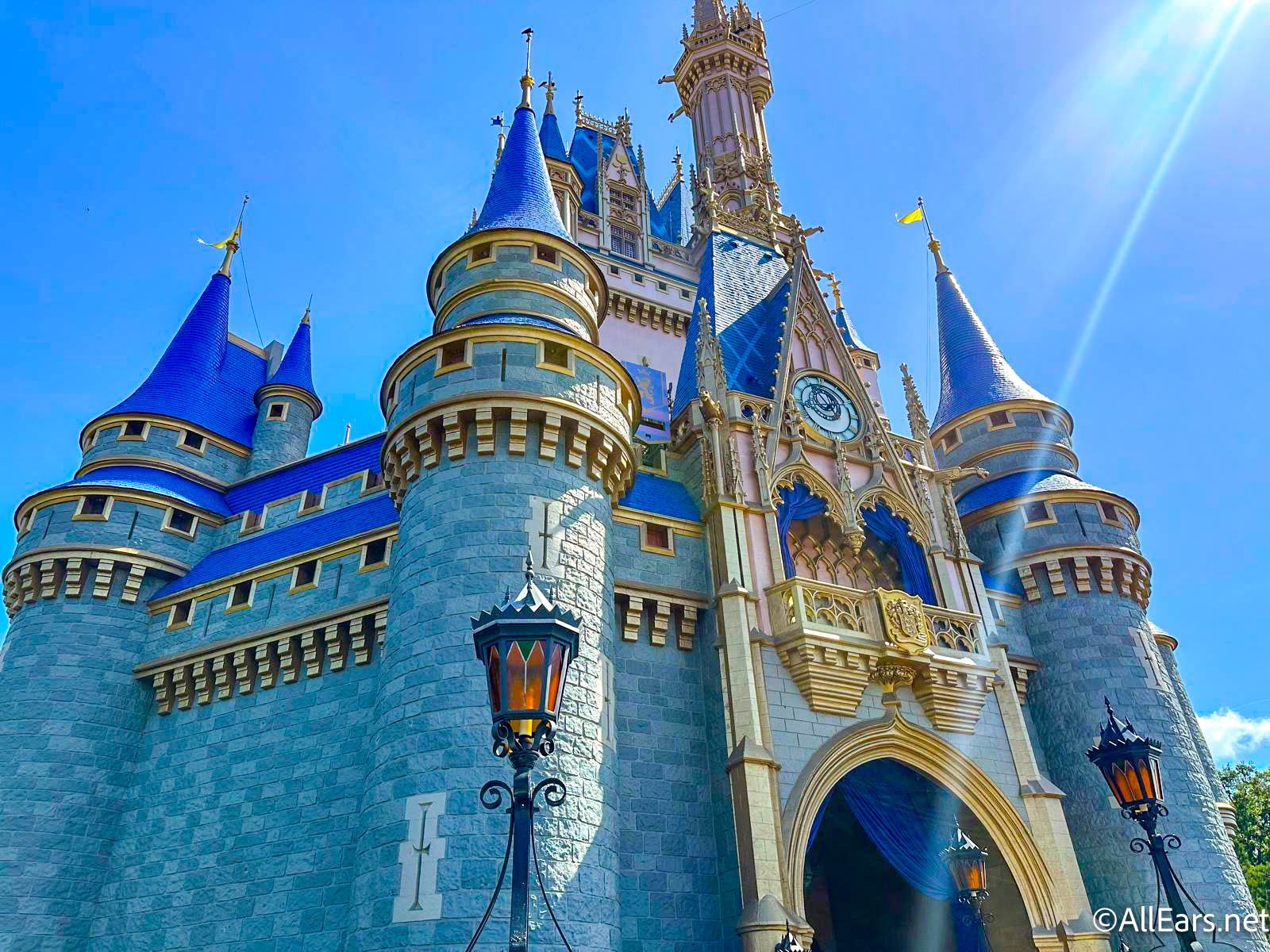
Today I’ll be discussing the various typefaces used at Epcot.
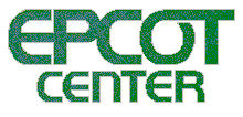
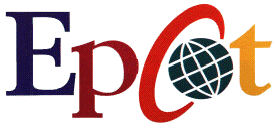
Epcot went through several name changes. First there was EPCOT Center. Then, in 1994 the named changed to Epcot 94 and the following year, Epcot 95. But it’s expensive to change a park’s name annually so in 1996 a new logo was introduced. The font went from a bold sans-serif typeface to a thinner serif font with some creative artwork thrown in for good measure. The “O” became a globe and the “C” became the bracket holding the globe.
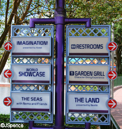
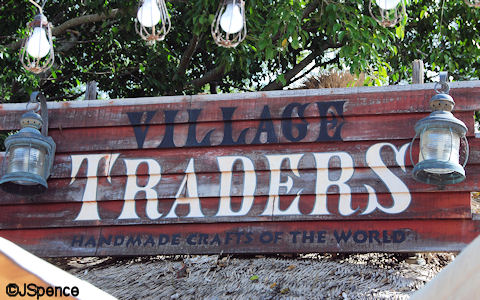
In the early years, only one font was used in Future World to designate all of the pavilions. Although the colors and presentation would change from building to building, the letter’s shapes remained constant.

Today, all of the pavilions sport their own, individual fonts, but the directional markers found throughout Future World still use the original typeface.
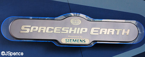
Let’s start our tour of Future World with Spaceship Earth. In some respects, this font is similar to the original EPCOT Center font – thick, sans-serif letters. One of the most obvious changes is they are slightly italicized. Of course SIEMENS, the attraction’s sponsor, uses its corporate typeface.

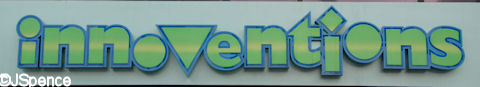
Innoventions recently received a new font. It’s playful and inviting and hopefully will make you curious enough to venture inside.
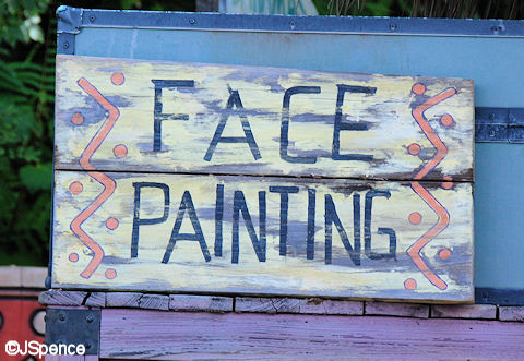
Once inside Innoventions, there are a host of activities to enjoy. Here are just a sample of the interesting signs and letters you’ll encounter.
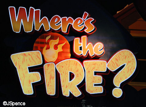
This first sign is pretty straightforward. “Where’s” and “the” both use hot colors and the word “Fire?” has flames drawn one each letter.
The Velcro Exhibit is silly and calls for a cartoonish style. Notice that all three words use a different typeface.

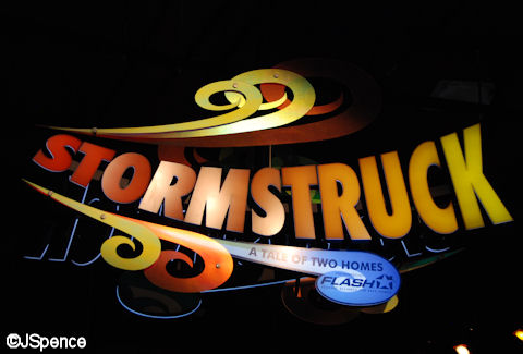
Check out this next sign. Note how the letters look like they’re being blown by the wind.
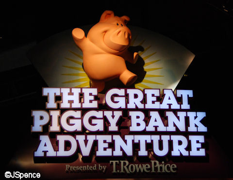
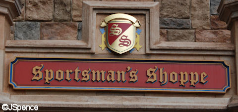
This next font plays double-duty. First, the title calls for a grand typeface. This is a “great” adventure and it requires impressive letters. But in addition, people take their money very seriously. Even though the attraction uses a cute piggy bank, the font still represents stability – something you want when trusting someone with your hard-earned cash.
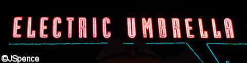
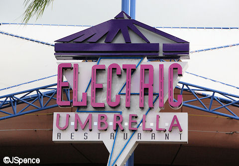
The “Electric Umbrella” has two distinct signs. The interior sign appropriately uses neon lighting inside the letters to play up the “electric” element of the name. The exterior sign also highlights this feature, but in a more subtle way. Take a look inside the letters. You can see “current” drawn in.
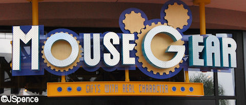
Besides the obvious gears incorporated into the “Mouse Gear” sign, the letters are made out of a textured metal to emphasize the industrial nature of the name.
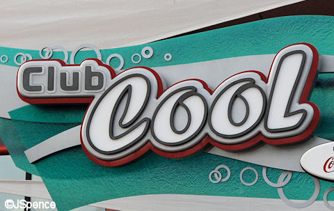
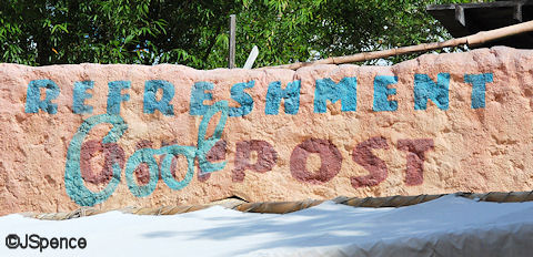
“Club Cool” uses a “cool” font. It’s that simple.
The lettering for “THE SEAS with Nemo & Friends” is the exact same font used in the movie posters for “FINDING NEMO.” The letters’ colors were selected because they match clownfish Nemo. This allows guests to easily associate the film with the attraction.
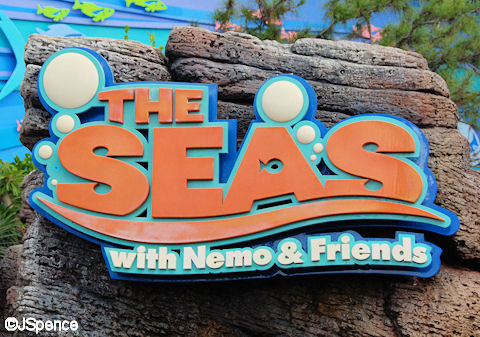
Although the letters are thinner, much of the lettering inside the pavilion is very similar to the title out front.
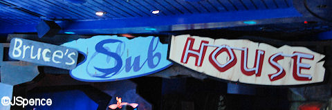
Bruce the shark lives in an area of the ocean that contains quite a bit of junk, including a sunken submarine. He’s labeled his home with a collection of discarded signs. If you look closely, the middle sign once said “Club” and the “Cl” has been painted over with an “S” to create “Sub.”
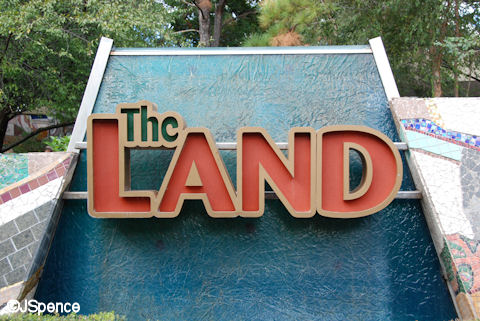
At one time, “The Land” was sponsored by Nestles. Although not identical, the typeface used on this pavilion is very similar to its former underwriter. But more than shape, color plays a part in this sign’s story. “The” uses green letters. “Land” sports brownish-orange letters. And the background is blue. All of these are “planet earth” colors.
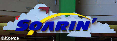
“Soarin'” uses several tricks to make us think of flight. First, the letters are blue to indicate the sky. A darker shade than “skyblue” was selected so the characters would contrast better against the white clouds. The font leans to the right, giving us the feeling of movement. And finally, an arc reaches to the clouds, symbolizing flight.
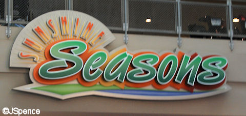
Color and letter placement help tell the story of the “SUNSHINE Seasons” food court. The word “SUNSHINE” uses a very thin, sans-serif font to signify the rays of the sun. “Seasons” uses green letters to represent plantlife and is set atop autumn colors.
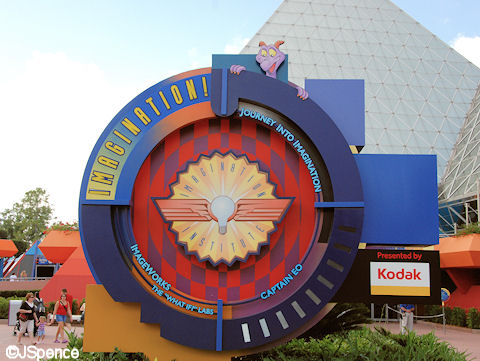
This sign out front of the Imagination Pavilion is designed to look like a giant camera lens. The word “IMAGINATION” uses a very thin, sans-serif font. This was done so the letters would match the calibration hash-marks on the opposite side of the lens.
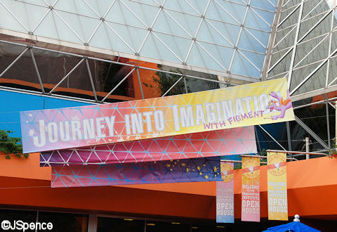
The font used on the “Journey into Imagination” attraction is a bold sans-serif font. Normally, such a typeface would be enough to grab our attention. But in this case, the letters are downplayed in favor of other factors. First, the white letters are placed on a colorful background with a grid that matches the pavilion’s pyramid. The banner is placed slightly askew, giving it a feel of informality. And finally, Figment can be seen adding his own touches to the sign.
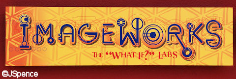
The “ImageWorks” sign uses one of the most ingenious fonts at Walt Disney World. A collection of gizmos, gadgets, and things have been woven together to create crazy letters. This lets us know a world of exploration lies ahead.
The font for “Test Track” is simple. However, the fact that the letters lean to the right makes our mind think motion. Also, the letters are supported by a structure that creates the look of a roadway.
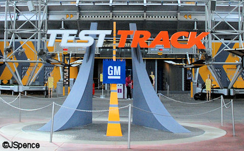
A second typeface is used at the “Test Track” pavilion. This lettering has a slight stencil look to it. This forces our mind to believe that this is an industrial facility.
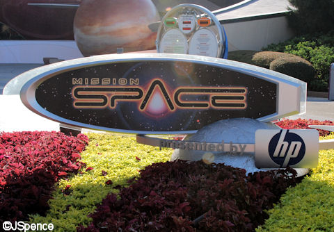
“Mission: Space” has a very futuristic font. Notice how the “S” and “P” and the “C” and “E” are joined together at the top.
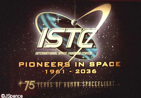
A second, more contemporary font was created for the “International Space Training Center.” On it’s own, you probably wouldn’t give this lettering a second glance. It’s the surrounding artwork that gives it a galactic aura.
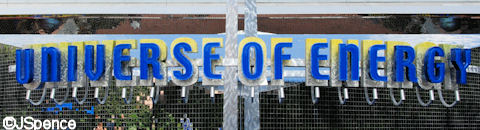
The typeface for “Universe of Energy” is simple and clean – just like we wished energy could be.
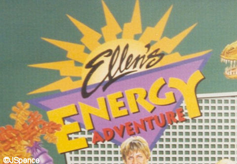
On the other hand, the font used for “Ellen’s Energy Adventure” is fun, as the Imagineers hope you’ll find the show.
Coming up with fonts for the World Showcase nations would not pose too much of a challenge. Dozens already existed that conveyed the charm and feel of these far off locales. But coming up with a typeface that would project an international flavor without singling out a particular nation would prove a little more challenging. Below is the logo selected to represent this area of EPCOT Center in the early years.
Unlike the pavilions in Future World, most of the countries of World Showcase do not have signs out front designating their nationality. The Imagineers hoped their design would be sufficient to tell the guests where they are. The first stop in our journey around the world will be in Canada.
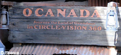
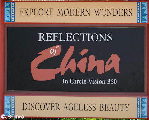
The “O’Canada!” movie has two fonts. The first is the clean lettering found out front of the pavilion. Notice how “Circle Vision” curves downward in the middle. This helps guests understand that the movie is presented in 360°.

O’Canada is shown deep in a mine so it’s appropriate the signage look like it was created out of old timbers.
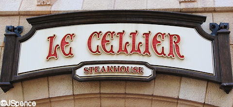
The large hotel in the Canada Pavilion is representative of those built by the national railroad as the country expanded westward. These were elegant hostleries which offered fine accommodations and services. The font for “Le Cellier” Steakhouse reeks sophistication and style.
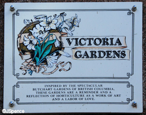
“Victoria Gardens” are manicured and formal. Not a blade of grass is out of place nor a bloom left on a branch after it’s time. The letterface here is stately and dignified.
The “United Kingdom” has numerous signs – far too many to display them all here. The “Rose & Crown” sports a somewhat formal font in gold letters. This style is commonly seen on such establishments in England.

A number of the shops in the UK Pavilion display decorative signs. The typefaces used could be considered “Old English” or “Old World.”

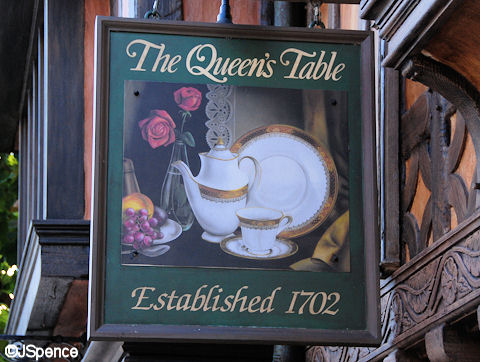
“The Queen’s Table” recalls royalty and demands an elegant font. A script seems to fit this bill nicely.
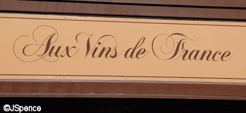
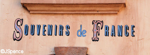
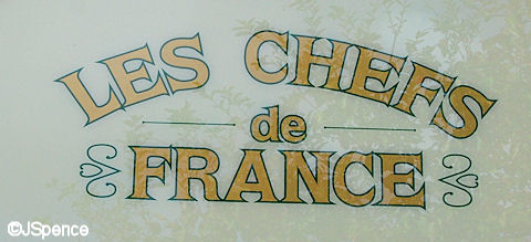
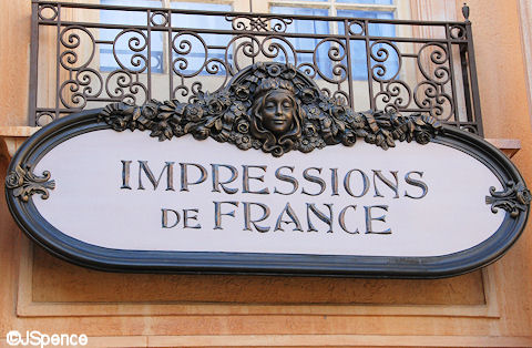
The France Pavilion represents the Belle Époque or Beautiful Age. The architecture here recalls the designs of Baron Georges Eugene Haussman and represents the last half of the 19th century. All of the lettering is authentic to this era and a great variety is used.
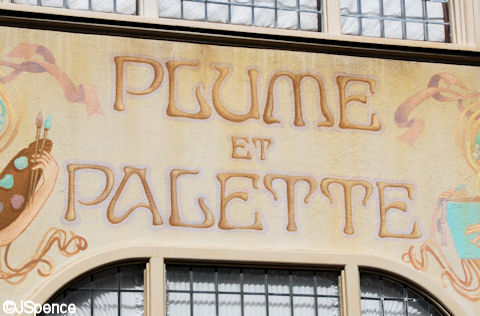
Art Nouveau fonts, similar to that used on the Paris Metro signage, can also be seen on several signs in the France Pavilion.
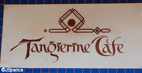
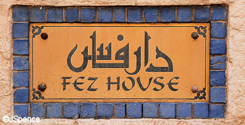
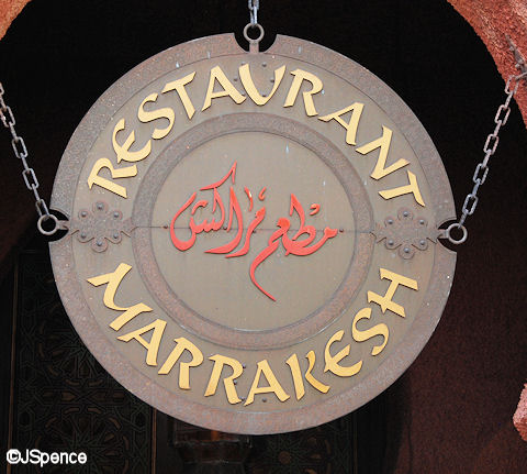
A few of the signs in the Morocco Pavilion use a stylized form of traditional Latin letters to give the feel of the Arabic alphabet like at the Tangierine Café.
Other signs list the name of the shop or restaurant in both a stylized font and in actual Arabic.

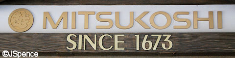
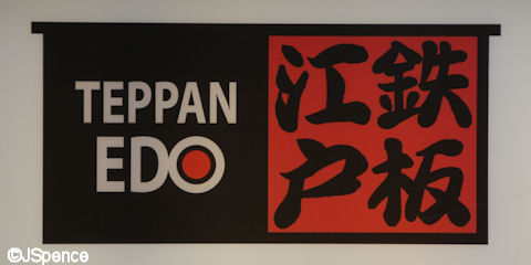
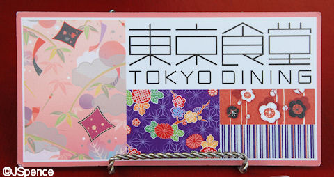
Mitsukoshi is the predominate participant in the Japan Pavilion. They sponsor the Department Store, Teppan Edo, and Tokyo Dining. In all three cases, the Latin letters barely hint at Asian characters. However, notice the variance in the actual Japanese letters. These are two different forms of writing used in Japan.
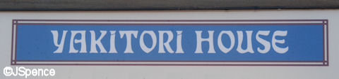
On the other hand, Yakitori House uses a much stronger stylization in its lettering.
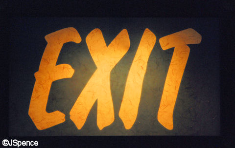
If you study this exit sign closely, you’ll notice it looks like it was written on rice paper.
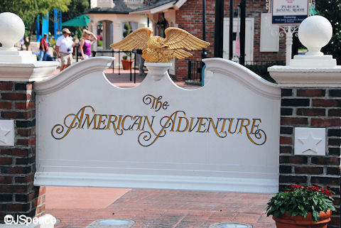
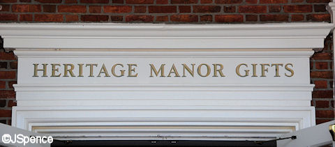
Although several different “stately” fonts are used in the American Adventure, it’s more interesting to note the signs’ coloring. For the most part, all of the signs in this area are white with gold lettering. This is even true inside the pavilion.
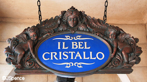
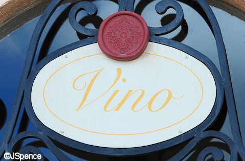
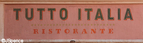
In Morocco, Japan, and China, most Americans are unfamiliar with their words and alphabet, but that’s not the case in the Italy Pavilion. Here, the Imagineers used Italian terms since Americans can usually pick out a word or two that is similar enough to understand.

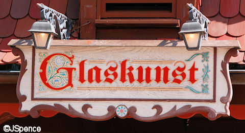
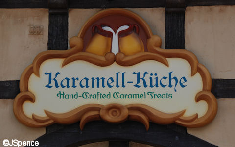
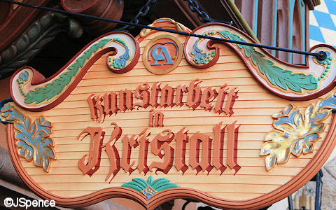
Unlike the Italy Pavilion that uses many different styles of typeface, the Germany Pavilion almost exclusively uses “Old World” fonts. But similar to Italy, an American can often pick out a word that helps them understand the merchandise inside.
African Outpost is a poor area. The signs here use old wood and in many cases, are hand painted.
Notice how this entrepreneur used the existing “Outpost” sign and with a little paint created a new merchandising stand.
It’s also obvious by the many crates and machines scattered around his establishment as to what product the merchant specializes in.
This largest sign in the China Pavilion uses a simple serif font for all of the words except China. “China” looks as if it was painted with a brush using an ancient art form of calligraphy writing called Shuta.
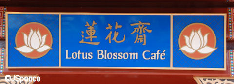
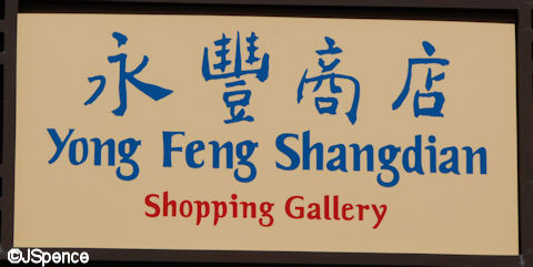
Other signs in China use stylized Latin letters alongside Chinese characters.
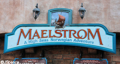
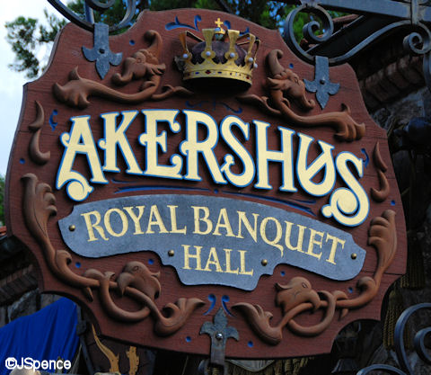
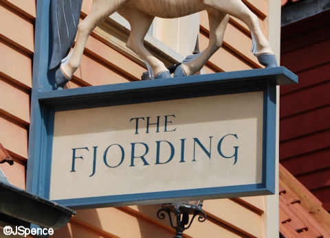
A number of the signs in the Norway Pavilion used stylized fonts to make you think of Scandinavia while others are extremely plain and simple.
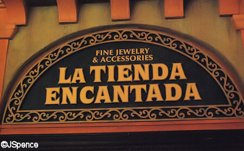
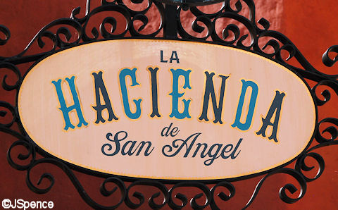
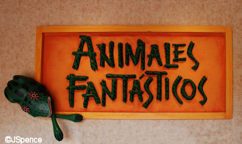
Like the many other nations at World Showcase, the Mexico Pavilion uses stylized typefaces to transport us South of the Boarder.
That’s it for Epcot. Check back tomorrow for my final blog about fonts at Disney’s Hollywood Studios.


Is there any chances to download any of these fonts?
I would like to use them.
Jack,
I consider you a ‘friend’ and when I get a new post I tell my family “oh you should see what my friend Jack sent today!” I just LOVE all your posts and try to soak up all the information for the next time I visit WDW so I can notice even more! Oh- also- thanks for the new Disney font!! I have already downloaded it onto my computer! Thanks for sharing the magic!
How interesting that of the World Showcase signs you photographed, all but Japan’s feature serif fonts. Or, if it isn’t a serif, it’s a script that has serif-like elements. Yet all the signs of the other half of Epcot are sans-serif. Perhaps this is meant to recall the technology and innovations of Japan? So many television shows I’ve seen lately that feature Japan are either about old things (ninja, samurai especially on History Channel) or about modern trends, often with a good deal to say about robots and similar technology!
You’ve just written a textbook, or at least an entertaining lecture, on the effective use of display fonts in themed signage. Very creative!
Jack, as a font nerd and a Disney fanatic, I am LOVING these entries. Especially this one, juxtaposing the “standard” font of vintage Epcot with the current ones.
I know you usually stick with WDW, but any chance of seeing font exploration at Disneyland and California Adventure, as well?
I really enjoy reading all of your blogs. You have an amazing eye for detail and great knowledge of Disney. Have you considered applying to be the next Dave Smith?
This continues to be fascinating. How long did it take you to photograph all these signs and work on these posts?? (Thanks for doing it!)
Jack’s Answer:
I live 30 minutes from the parks (1 hour both ways). I made four trips down to Disney (one for each park). Then it took me about an hour and a half in each park. This adds up to 10 hours just to take the pictures. It easily took me 20 hours (or more) to process the pictures and write the article. So I spent 30+ hours creating this blog series.
hey jack
I love how the not only the fonts but the colors as well go along with the different attractions. They all fit together just like a puzzle. can’t wait for yor next blog and as always keep up the great work
Thanks Jack!
I especially liked the exit sign. One of my favourite examples of hidden theming is how they do exit signs in locations in which they would be anachronistic – like the bones spelling out “exit” in Pirates of the Caribbean.
Thanks, Wendy