

Yesterday I discussed the typefaces used in the Magic Kingdom. Today I’ll explore the fonts of the Animal Kingdom.
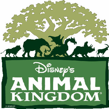
The logo for the Animal Kingdom uses three fonts. “Disney’s” is written in a script that resembles Walt’s hand writing. “ANIMAL” uses block letters but only the “A’s” have serifs. Although it’s difficult to make out in this picture “ANIMAL” has rough edges, giving the word a “natural” feel. “Kingdom” uses a relaxed serif text-type font.
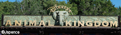
A large sign announcing the park graces the entrance. The letters are block with ever so small serifs.
The Oasis has very few signs so we’re going to jump ahead to Discovery Island. This section of the Animal Kingdom is not supposed to represent any particular place on the planet, yet it still celebrates animals. To accomplish this, the buildings use whimsy and bright colors to invite guests inside.
The typefaces used on Discovery Island are interesting and appropriate, but nothing outstanding. It’s more about the signs than the fonts. Here are two examples.


However, some imagination was used on these next three signs. The “Pizzafari” marker resembles a pizza. The “Creature Comforts” sign uses snakes to create the “C’s”. And the “Flame Tree Barbecue” sign uses letters that look like branches and they’re painted the color of BBQ sauce.


Along the nature trails, there are a number of signposts describing the various animals. All of these signs use the same font for consistency. Once again, the font is interesting, but doesn’t suggest a particular location on the planet.

As you head toward Africa, a caricature of a giraffe can be seen holding an “AFRICA” sign. The colors and style are keeping with the playfulness of Discovery Island. But as you continue on your journey you come to a set of gates announcing your arrival to the Dark Continent. This time, a serious tone is imparted with carved wood and natural colors.


Wood is scarce in Harambe. Because of this, many of the signs are painted directly on the walls of the buildings. In most cases, this has been done by the owner and the lettering is crude. Although in one case, the individual tried to be somewhat professional and used a stencil.


Even when a merchant can find wood, he usually still can’t afford to pay for a skilled sign painter. Some signs show talent, others do not.


This next hand-painted sign tells a story in its simplicity. You know exactly what type of transportation lies ahead when looking at this billboard.

Professional signs in Harambe still lack the sophistication we’re accustomed to in more prosperous regions of the world. A lot of care was taken when creating these signs, but they still have a primitive quality. In all probability, they were created by a talented artist who lacked formal training.


The entrance to Asia is marked with a large arch. Notice how the Imagineers gave the Latin letters an appearance of Asian characters to help set the mood.

Even if Coca Cola wasn’t written in English in small print, you would know in an instant what this merchant was selling. This logo and font is one of the most famous in the world.

Like Harambe in Africa, Anandapur in Asia is also a poor community. However, in many respects this village seems closer to prosperity. Much of this is evident by their signage. Although some writing can be found on walls, more of it is on wood and even metal. In addition, the lettering is far more professional.


Notice how the shadowing and colors on the lettering suggest water on the “Kali River Rapids” sign.

Another indication that Anandapur is prospering can be found next to this advertisement. It seems that one gentleman is able to make a living painting signs.


The “EXPEDITION EVERST” sign hints at the NÄ”pÄlÄ« alphabet. Once again, this helps set the mood on a subconscious level.

Dinoland U.S.A. can be divided into three areas, the Dig Site and Lodge, the Dino Institute, and Chester & Hester’s Dinorama. Each has its own distinct lettering style. Let’s start with the Dig Site and Lodge.
Grants are hard to come by and money is usually tight when unearthing dinosaur bones. Hand-painted signs are common, quick, and cheap.

This next sign uses neon tubing to form the letters and immediately conveys an era and atmosphere. Signs like these were common along the highways of yesteryear and pointed the way to a greasy spoon.

Before dinosaur bones were discovered in the area, a hunting lodge could be found nearby. In the years that followed, the paleontologist and college students took over the building and converted it to their needs. A generic “restaurant” sign was transformed with the addition of a corrugated metal sheet and hand-painted lettering.

The Dino Institute has backers and money. There is nothing cheap or second rate about the signs used at this establishment. Top dollar was spent on advertisements and plaques. The “Dinosaur” poster features a font with ragged edges, befitting of the explosion taking place behind the letters. The Institute plaque and Gift Shop sign use narrow sans-serif fonts that look sleek and modern.


Chester & Hester’s Dinorama is a carnival. Bright, garish colors and blinking lights make up most of the lettering here.


The font used for “Finding Nemo, The Musical” is identical to that used for the movie posters and advertisements. Once again, this adds continuity and allows the guests to easily identify with the show inside.

The final land at the Animal Kingdom is Camp Minnie-Mickey. Many of the letters here are formed with twigs and branches – as if the kids attending the camp had created them.


Two different fonts are used for the “Festival of the Lion King” show; neither resembles the typeface used in the movie. This was done intentionally to help guests separate the film from the show. In the movie, we’re told the story of Simba. At the Animal Kingdom, we celebrate Simba with music and pageantry. These are two very different presentations. However, there is a similarity between one of the Animal Kingdom fonts and the Broadway poster.


Throughout the Animal Kingdom are signs with arrows pointing the way to the various attractions and facilities. However some of these arrows have been given details that make them look like fish.

That’s it for the Animal Kingdom. Check back tomorrow when I discuss the fonts used at Epcot.


Jack,
As always, great job. Thanks for pointing out something that might go unnoticed by many and yet adds so much to the stories and theming at the Disney Parks.
Hermes
Great, fun blog! Question – does the current AK logo have the dragon in it like the one at the beginning of blog? I know that mythical/magical idea was part of the original idea for AK, but I don’t remember that on the logo! Am I just missing that detail?
Jack’s Answer:
Yes. The dragon is still part of the logo. Disney has not abandoned the mythological aspect of this park. In fact, they say the yeti at Expedition Everest fits into this category. I’m still holding my breath that someday, Beastly Kingdom will become a reality.
Jack,
Great information! I love Disney Detail! Quick question, though, that leads back to detail. The Harambe pics show power poles/lines. I know that there are not supposed to be visible power poles/lines in the World, so I have to think that this is part of the detail of Harambe. Am I correct?
Jack’s Answer:
Yes. You are correct. These lines to not carry any power or phone transmissions. They are just props.
Hi Jack – Love the article! I also pay attention to the signs, though not as detailed as you. If I may offer a suggestion, an additional blog about the Highway, Road, and Transport System signs would be great. They differ from the standards set by the Feds, but are similar. The Transit system graphic signs for the monorail, ferry, bus, etc. are totally Disney. Some of the roadway appliances such as sign posts and bus stop bollards also send messages. The typefaces on many of the signs are unique to WDW, though extremely familiar. The funky, Jetson’s/Googie style direction signs with the malted blender green bases are ‘out of this world!’
Anywho, can’t wait for the rest of the parks!
– Jeff
What a fun “walk” we are having with you! Will look forward to the next part of our “walk”.
hey jack
once again the details in the signs are absolutly amazing. It shows that the littlest details are really the best. can’t wait for your next blog and as always keep up the great work
Hi Jack, I´ve always love the little details in everything Disney, but the way you describe it, is simply great. Thank you again to let us walk with you.
Hi Jack,
I’ve always thought that Animal Kingdom would be a graphic artist’s paradise. The sheer diversity of different regions in the world, mixed with the opportunities for creative whimsy. What a fantastic job to have.
Looking forward to the next in the series.
Greg
Jack, I am *loving* this series. I’m always fascinated by all the small details that go into the theming of the parks. Font selection is a detail I never would have thought to look at, but seeing and reading your explanations and depictions of the fonts adds much more to the experience, the “story” that we’re a part of. Thanks very much!