For the 50th Anniversary, Disney World is changing a bunch of things…but probably not things that you’d notice!
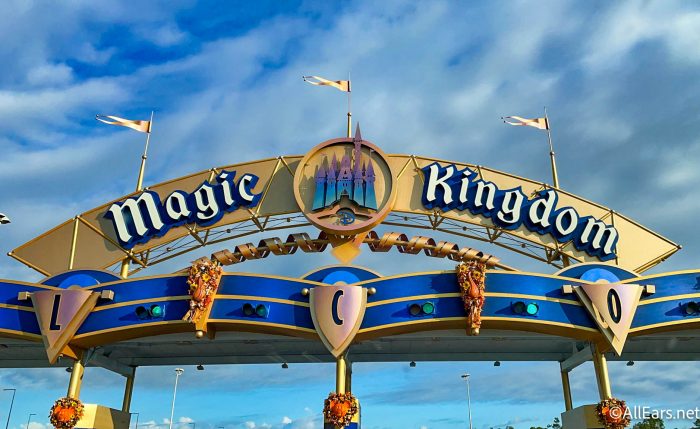
What do we mean? Well, all around the property, we’ve seen little refurbishments, from new paint jobs on opening day attractions to updated signs. Disney took on a lot of these little projects ahead of October 1st, but it seems that the work is not done yet!
We already saw the main entranceway signage get updated at Walt Disney World. The vintage purple look was painted over, now replaced with bold blues and gray accents.
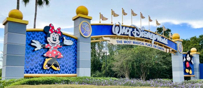
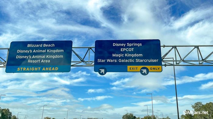
And now, it seems as though the other road signs are getting an update to match. For years, Disney World has been marked with iconic purple signage — but those will soon be replaced with a modern blue version.
We’ve already seen one sign replaced — Disney World took the opportunity to update the one that leads toward Star Wars: Galactic Starcruiser ahead of its grand opening. More signs like it will be added throughout 2022 and beyond.
We’ll be on the lookout for more sign replacements and we’ll update you if anything else gets refurbished soon. Stay tuned to AllEars!
Click Here to Get All the Details on Disney World’s 50th Anniversary!
Join the AllEars.net Newsletter to get the free list of 50 Ways to Celebrate Disney World's 50th Anniversary! Click here to get started!

What do you think of the change? Do you like the old signs or new signs better? Tell us in the comments!






I actually like the blue. Blue is my favorite color! There are a lot of changes that Disney has made that I’m not happy with but I like the new signs. The purple ones definitely needed a make over!
As I read more and more of all the changes happening, I’m not really wanting to go to WDW. The purple signs are just a small part of unnecessary change. You are pricing people out of a magical family vacation. If it ain’t broke, don’t fix it!
Disney just took another step towards blending in with every other park. I liked it when Disney was individual and stood out among the crowd. Now they are just blending in with the crowd. These signs look like they came straight from the State Dept. of Transportation signage shop. Zero creativity here.
When you saw the purple signs you knew you were in a special place. No where else, that I know of, uses purple directional signs. Blue signs are not exciting, nor very special. They might as well be highway green.
Honestly, sometimes change isn’t about making things better, it’s about someone wanting to put their own personal stamp on it. I hope they feel validated.
I like the purple. It’s distinctive and connotates magic.
When I ran for a county office there was great debate about what colors to use in the campaign signs and logos. It’s been shown that people more easily see blue with yellow over any other combinations.
Disney, stop changing things constantly. This Blue is boring, the purple/red sign were very colorful and “happy”, we starting playing our Disney park music in the car, once we saw the first sign. Disney just stop changing, y’all have totally screwed up something that was wonderful, and I’m not just talking about the signs!!!stop chipping away at everything that is magical to Disney world.
I hate them! Disney can’t seem to leave well enough alone! Slowly removing the icons that make Walt Disney world what it was! It’s supposed to be a wonderful fantasy bubble! It’s turning into a bah nightmare.
I think the blue is boring. I liked the purple better. I am not opposed to change just don’t like the blue.