

Without signs, we’d be lost. We need them to navigate through life. They give us directions. They label places and things. They educate. They are a necessity.
We also take signs for granted. We use them all the time. However, the moment we understand the message, we move on without a second thought. But signs can do more than just impart a particular piece of information. They can help tell a story if designed correctly. And who tells a story better than Disney?
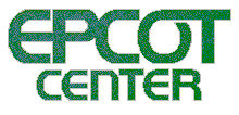
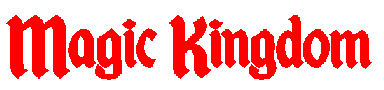
Today’s blog will not focus on the signs at Disney World as much as the lettering used on them. The Imagineers could use “Courier” or “Arial” fonts on everything, but this would be boring and unrealistic. For centuries, new typefaces have been created to grab our attention. And as time passed, these typefaces became associated with the era in which they were created. Other fonts are not as time-driven as they are object driven. For example, a font that is trying to invoke the feel of Hollywood might form the letters out of filmstrips. Without even realizing it, the “letters” as much as the “words” convey an atmosphere. Let me give you two examples of how the wrong font and colors send our brains mixed signals. Take a look at this first picture. The moment you see these familiar names, you know something is wrong.
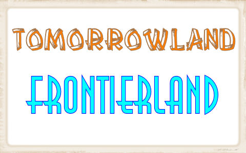
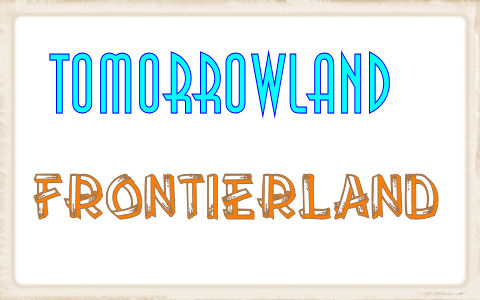
Now let’s try the same thing again, only this time, I’ll use the same fonts and colors, but put them with the appropriate name. Better?
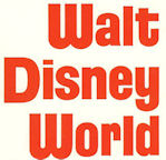
In this blog series, I’m going to tour the four theme parks at Walt Disney World and showcase some of the fonts used in various areas. But before I do, let’s start with the name of the resort, Walt Disney World. It has seen two (and a half) designs since its inception.
The first font used had a clean, forward-thinking feel about it. When you compare this to the font used at Disneyland in 1971, you’ll see a stark difference.
There is a reason for this difference. If you remember your Disney history, the Magic Kingdom was to be just one component of Walt Disney World. Plans called for additional hotels, an airport, and eventually EPCOT, the Experimental Prototype Community of Tomorrow. EPCOT was to be a futuristic city, so the name “Walt Disney World” needed to convey this characteristic from the beginning. Take a look at how similar a font was used when EPCOT Center opened (as a theme park) in 1982.
As the years progressed, the Mickey Mouse in the middle of the “D” was dropped.
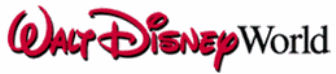
For Disney’s 25th anniversary, the Imagineers decided the resort name/logo needed a new look. In an effort to remember the company’s founder, “Walt Disney” was written in a script that resembled his handwriting. “World” was written in “Times New Roman” to set it apart from Walt’s name.
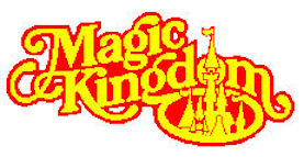
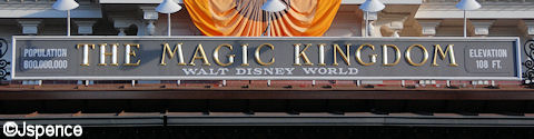
We’ll start our tour of the parks in the Magic Kingdom. Used on printed material, this name has also seen two fonts. However, the lettering that graces the Train Station has remained constant for 39 years.
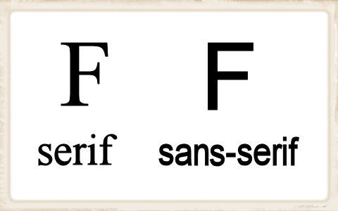
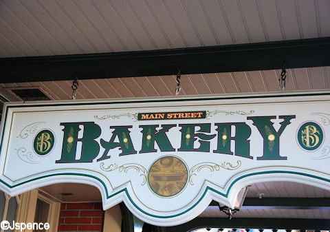
Like all guests who visit the Magic Kingdom, let’s start on Main Street. The fonts used here are fancy and elegant. America was prospering in the 1890s/1900s and the typefaces used in this era had a rich feel about them. Almost without exception, the lettering used on Main Street are serif fonts.
For the most part, text-type fonts can be divided into two categories, serif and sans-serif. A “serif” is a detail that is added to the ends of the strokes that make up the letter. “Sans” means “without” in French, so a sans-serif font lacks these details.
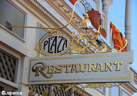
Here are few pictures of Main Street Signs. Look how elegant they all are. Also, notice the use of gold lettering.
Tomorrowland was planned in the mid to late 1960’s. At that time, our concept of the future featured clean lines and an abundance of concrete. There was almost a sterile quality about it. So the lettering on some of the original and early attractions carries on this feel, even if the font for the given attraction has changed over the years. Take a look at these examples – all using sans-serif fonts. Also notice the choice of color. All are “cool” featuring blues and greens.
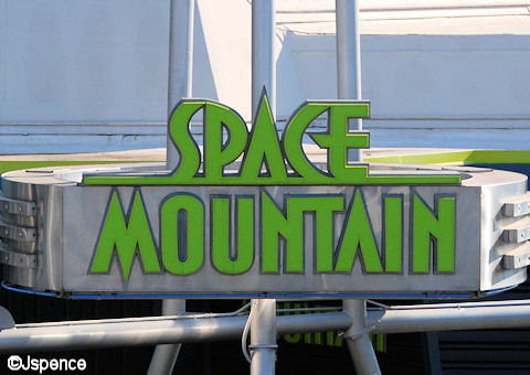
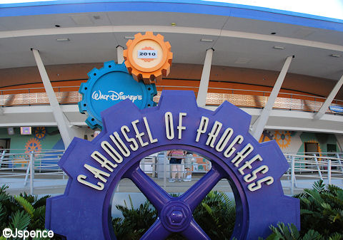
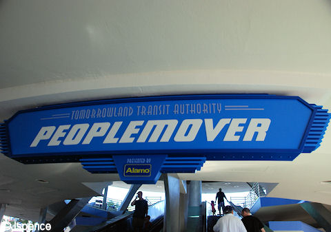
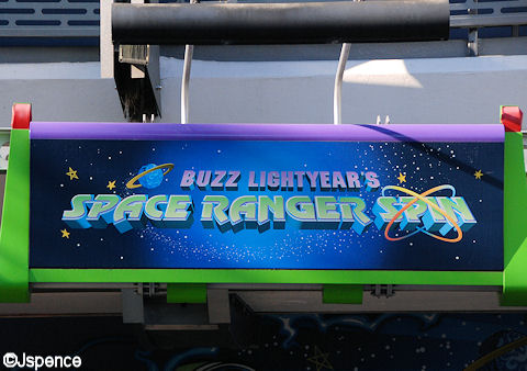
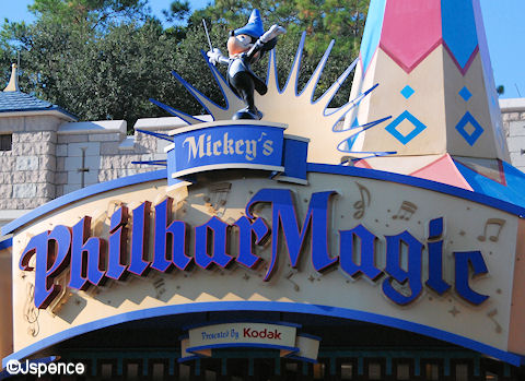
But Tomorrowland has evolved over the years. Several of the new attractions have taken on a playful feel. For the most part, sans-serif fonts are still used, but the straight lines seen on the older rides have given way to slight curves and thicker letters on the newer additions, giving the words a playful characteristic. Cool colors are still predominant, but “warm” colors play a bigger part of the design.
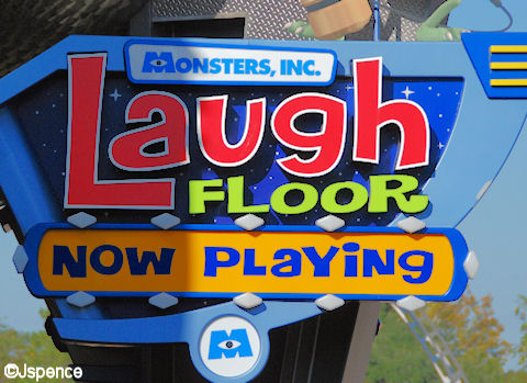
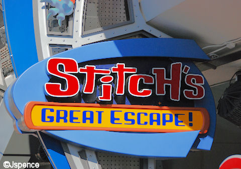
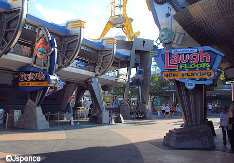
It was also important to coordinate the signs for “Monsters, Inc. Laugh Floor” and “Stitch’s Great Escape.” Since they are located across the walkway from one another, they must blend with and complement each other.
Disney even created a font specifically for Stitch called “Space Encounter.” An example of it can be seen in the “Stitch’s Great Escape” attraction. You can search for it on the internet and download it to your computer.
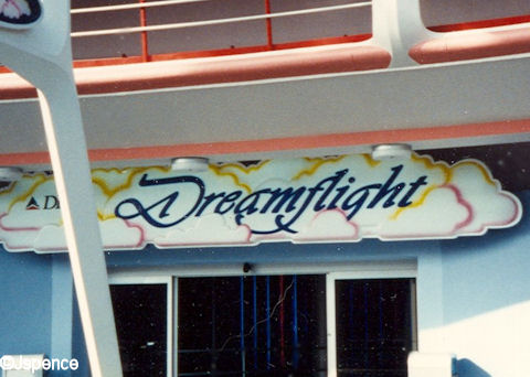
But not all fonts used in Tomorrowland have been sans-serif. When Delta Airlines sponsored “Dreamflight,” it was decided that a script typeface would better represent the attraction. After all, dreams should be “soft” not futuristic.
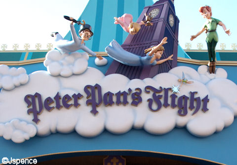
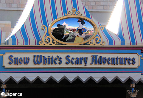
Fantasyland was designed with a medieval European atmosphere. Sans-serif fonts would definitely be out of place here. This was a time when monks labored for years copying books by hand in elegant calligraphy. So it’s only fitting that the typefaces found in this enchanted land mimic this ancient art form.
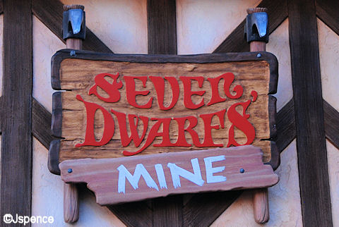
Sometimes, one font isn’t enough to tell the story. In the following picture we see an ancient typeface combined with a hand-painted sign. We have to assume one of the seven dwarfs added this piece of timber as an afterthought.
But not all of Fantasyland is medieval. As we head toward Mickey’s Toontown Fair, the attractions take on a more playful tone, as do the fonts.
Take a look at the typeface in the following picture.
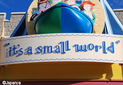
This is the same font that was used when this attraction played at the New York World’s Fair from 1964-65. By the way, the correct way to write this attraction’s name is in all lowercase (small) letters with quotes. “it’s a small world”
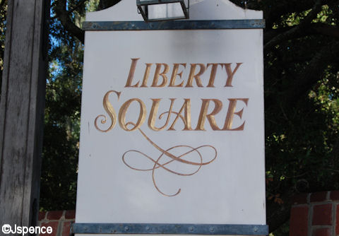
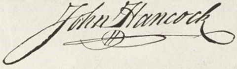
Formality reigns in Liberty Square. This land calls for dignity and decorum. The entrance sign is stately and contains a flourish reminiscent of John Hancock’s signature.
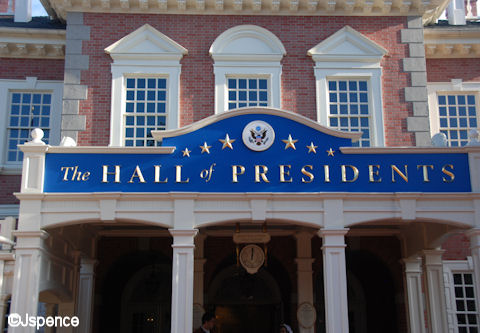
The Hall of Presidents attraction features a simple serif font with “The” and “of” in a semi-script typeface. The gilded letters against a blue background make the words stand out in an impressive manner, befitting of the presentation seen inside.
Disney created a special typeface for the Haunted Mansion. These letters portray a stately, yet somewhat sinister message. The font is called “Ravenscroft” and was named after Disney Legend, Thurl Ravenscroft (Tony the Tiger). If you like this font, it can be downloaded from the internet (Google: Ravenscroft font).
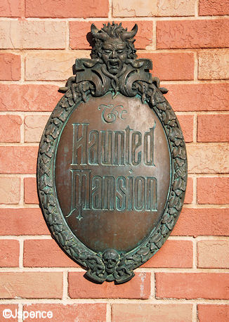
Thurl Ravenscroft provides the voice of the lead bust in the graveyard scene. However, I’ve always wondered why the font wasn’t named “Frees.” Paul Frees provided the voice for the Ghost Host and has a much more prominent presence throughout the attraction. Maybe the Imagineers were playing on the fact that “raven” is contained in the name “Ravenscroft.”
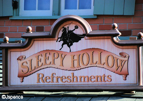
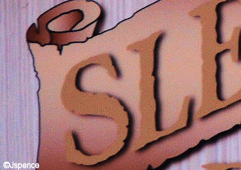
At a first glance, the “Sleepy Hollow Refreshments” sign is unremarkable. But if you look closely, you see that the scroll and letters have ragged edges. This is subtle, but it still imparts a message of spookiness.
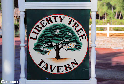
The font for Liberty Tree Tavern is also rather basic. But by painting the letters in two colors, a three dimensional quality is achieved. This adds a more formal feel to the sign.
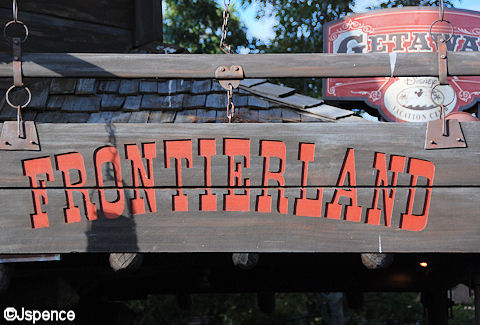
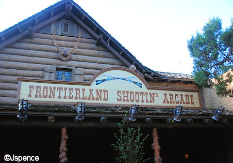
The Old West was rustic and many of the fonts used in Frontierland are simple and crude. However, the good citizens of this area wanted to make a positive impression on visitors and created a welcoming sign using a typeface that was popular during this era.
The “Frontierland Shootin’ Arcade” uses a similar font.
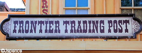
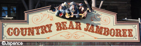
The “Frontier Trading Post” and “Country Bear Jamboree” have taken this basic western font and added some flourishes and curves to liven things up.
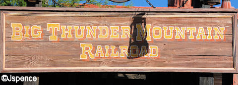
“Big Thunder Mountain Railway” reverts back to the basics, but color and shadow effects make this sign come alive.
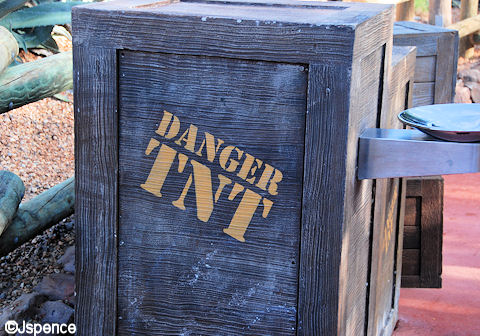
There are a number of wooden crates scattered around the queue of “Thunder Mountain.” As you would expect, stencils and cheap paint were used to identify their contents.
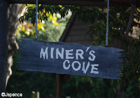
It’s obvious this next sign was created by one of the prospectors in the area. Whitewash paint and an old board were all that was needed to convey his message.
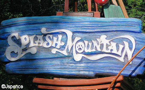
The font used for “Splash Mountain” is ideal for this attraction. Look at the “S.” It looks like splashing water. And the line between the “M” and “N” suggests a flowing river. Then of course there is the critter paw print in the “O.” This simple sign provides the reader with a good idea of what’s in store for them if they continue in this direction.
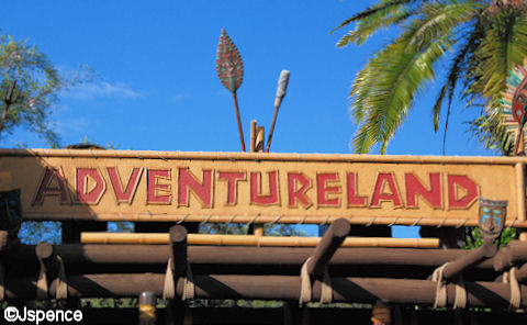
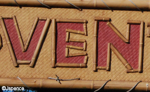
Exotic and tropical locales can be found in Adventureland. And this mood is instantly conveyed to the guests as they pass under a sign made of woven matting and bamboo letters.
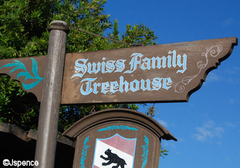
The first attraction you come to in Adventureland is “Swiss Family Treehouse.” But you won’t find a tropical font here. The Imagineers wanted there to be no doubt that the inhabitants of this home were from Europe and used an Old World typeface to convey this message.
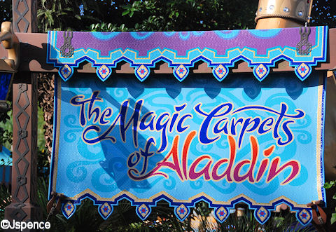
The story of Aladdin takes place in medieval Arabia. On this next sign the Imagineers used a font that ever so slightly hints at the Arabic alphabet. In addition, this is the same font used in the “Aladdin” movie. This provides us with continuity between the story being told on screen and the one being told in the Magic Kingdom.
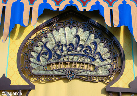
A different, but equally exotic font can be seen nearby at the Agrabah Bazaar. Here too a Middle Eastern feel is captured in the lettering.
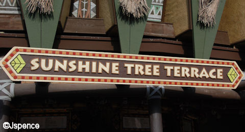
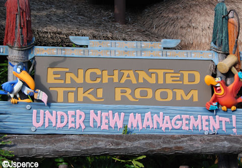
Both the “Sunshine Tree Terrace” and the “Enchanted Tiki Room” use fonts that we associate with Polynesia. But a rascally element has been introduced by Iago with his hand painted sign. This addition tells the guest that mischief is in store inside the attraction.
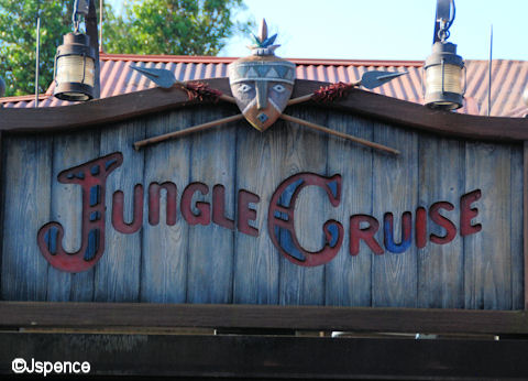
The “Jungle Cruise” presented a problem in that the attraction simulates travels through three continents, South America, Asia, and Africa. What typeface would represent all three? In the end, a font that could be either tribal African or South American was selected. In this case, the mask helps set the locale.
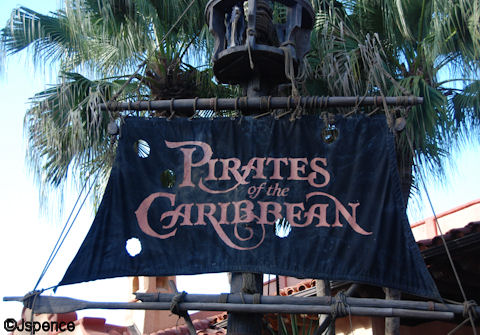
The final font we’ll talk about in the Magic Kingdom is at the “Pirates of the Caribbean” attraction. This typeface takes broad strokes. It’s unafraid. It’s in your face. Much like the swashbucklers found inside.
That’s it for Part One of this series. Check back tomorrow when I discuss the fonts of the Animal Kingdom.

Another great blog on the little details that make Disney Disney. As a graphic designer I really appreciate all the work that goes into selecting the perfect font/color/layout to evoke that perfect attraction theme. Imagine how different we’d feel about the attractions if all the signs were black and white and written in Times New Roman!
I love your blog Jack! You always give us yet another side of Disney the average person misses! I can’t wait for my next trip to really spend time to study all the little details that have always been there, but I have missed.
Thank-you for pointing out why Disney is Disney!
Jack-
Another really cool post! Your topics are always so creative and insightful. Disney wouldn’t be Disney without these kinds of details, and I’m so glad you think to point them out to us. 🙂
Samantha
This is especially interesting to me as a scrapbooker. I try to find the right font for journaling and headlines for my Disney page layouts. I have been able to find some Disney fonts online Free but not all. Any info on this?
I’m not going to lie, I’m not always interested in informative or historical information about WDW, but this was so interesting. Thanks for this post, and I can’t wait for the next in the series!
Jack-
Amazing stuff here! I am a illustrator / graphic designer so walking around WDW is a real treat. I am fascinated with the amount of typography created here. I also get a kick out of when i see fonts i use on my own that are used in the parks. I also like to catch them reusing fonts throughout the resorts. Off the top of my head, i know that they use the font for “Sunshine Tree Terrace” in the “Circle of Life – An Environmental Fable” sign (located in the Land Pavilion in Epcot) and they reuse the “Tomorrowland” font on the “Sunshine Seasons” sign (located in the Land Pavilion in Epcot). Thanks and I can’t wait to see your other articles.
I love Disney World’s theming and details! This is such a great example of them, and a great blog! Thanks for taking the time to share with us. Can’t wait for the next installment!
Wow! This is exactly the kind of article I LOVE!!! There’s so much detail that I’ve managed to miss over the years! I love all the thought that’s gone into these signs and fonts and it had never occurred to me before – they’re so successful because they blend into the environment they’re in. Brilliant! Thank you Jack – looking forward very much to the rest in this series!
Hi Jack,
Excellent blog! I’m so glad you chose Disney signage to showcase this week. It so often goes nearly unnoticed. I’ve been acutely aware of the signage design going back to my early teen years at Disneyland.
As a frustrated filmmaker (at the age of 12) I had souvenir books from Disneyland, and copied the best fonts from the books for title cards to use in my 8mm movies I shot at Disneyland. I wish I still had those old films today.
Like a previous poster, I initially misread your example of “incorrect” color and font. Of course being dyslexic doesn’t help.
Greg
What a fun idea for some posts. I’d never given any thought to the fact that the font style was so carefully planned!
Great post–I love Disney World signage. Would you believe that in your first example, I initially read “Frontierland” as “Futureland”? That just goes to show how powerfully these fonts communicate meanings.
hey jack
wow it is absolutly amazing how things as simple as signs contain so much meaning. It is amazing how much little detail there is when it comes to these signs and how the font goes along with the land that the sign is in. can’t wait for your next blog and as always keep up the great work